What was needs to be done for this project.
The UI
Branding
Visual Design
Design Elements
The UX
Why ?
Key features
User Flow
Prototyping
Accessibility and Testing
THE UX
WHY ?
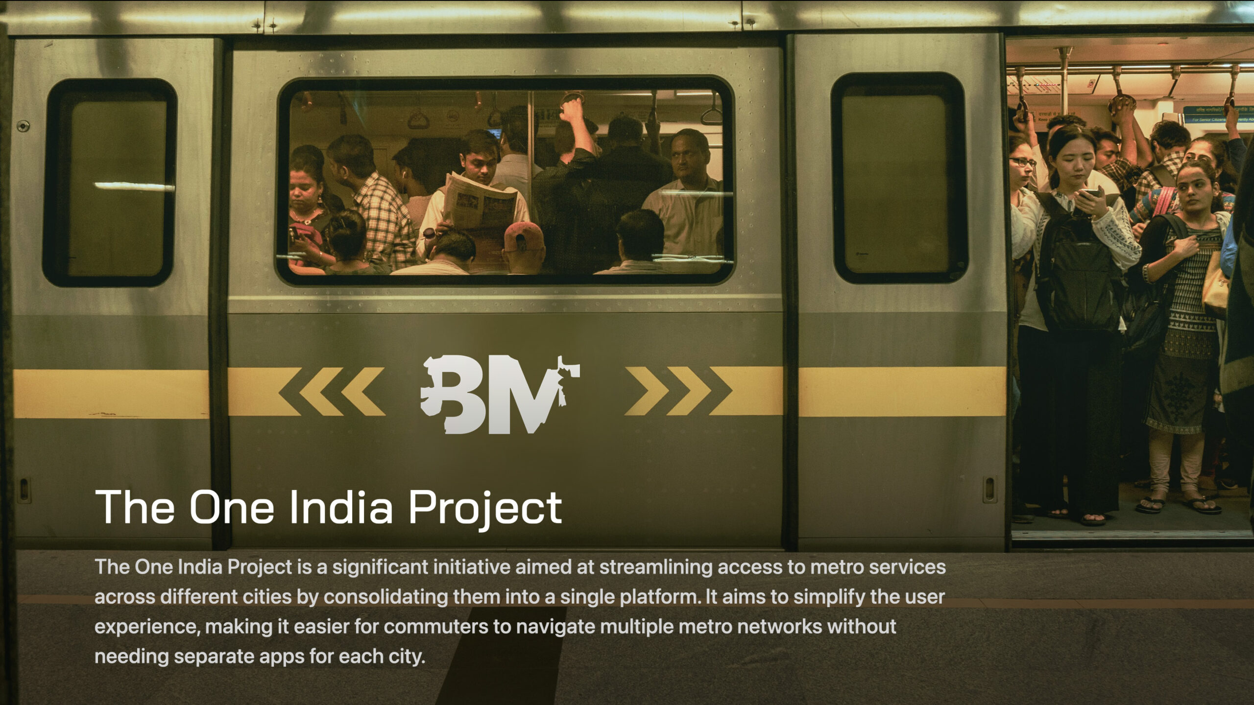
The Problem Statement
It’s challenging to explore unfamiliar places in a different city while keeping expenses low and ensuring safety. An all-in-one app that offers navigation, maps, additional services, and a secure environment would be invaluable.
The Solution Statement
Having all metros across India under one umbrella organization would foster a sense of familiarity, ease, unity, and safety for commuters.
The Process
Empathise, define, ideate, design, test
RESEARCH
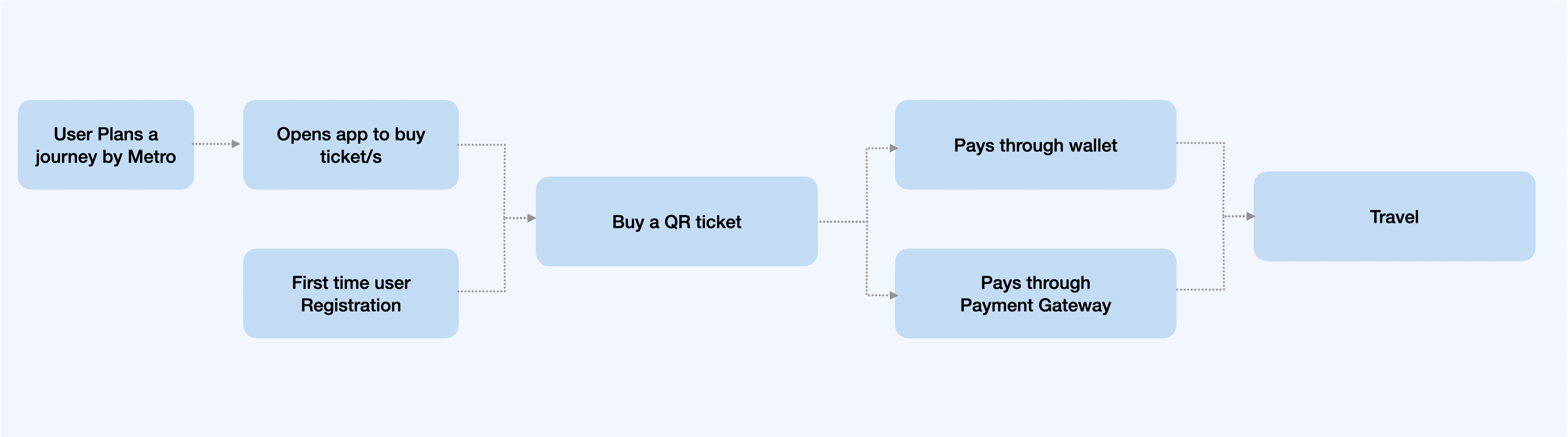
- User Flow:
- Onboarding: A simple, intuitive onboarding process with a few screens explaining the app’s benefits. Offer users the option to select their preferred city or metro network initially.
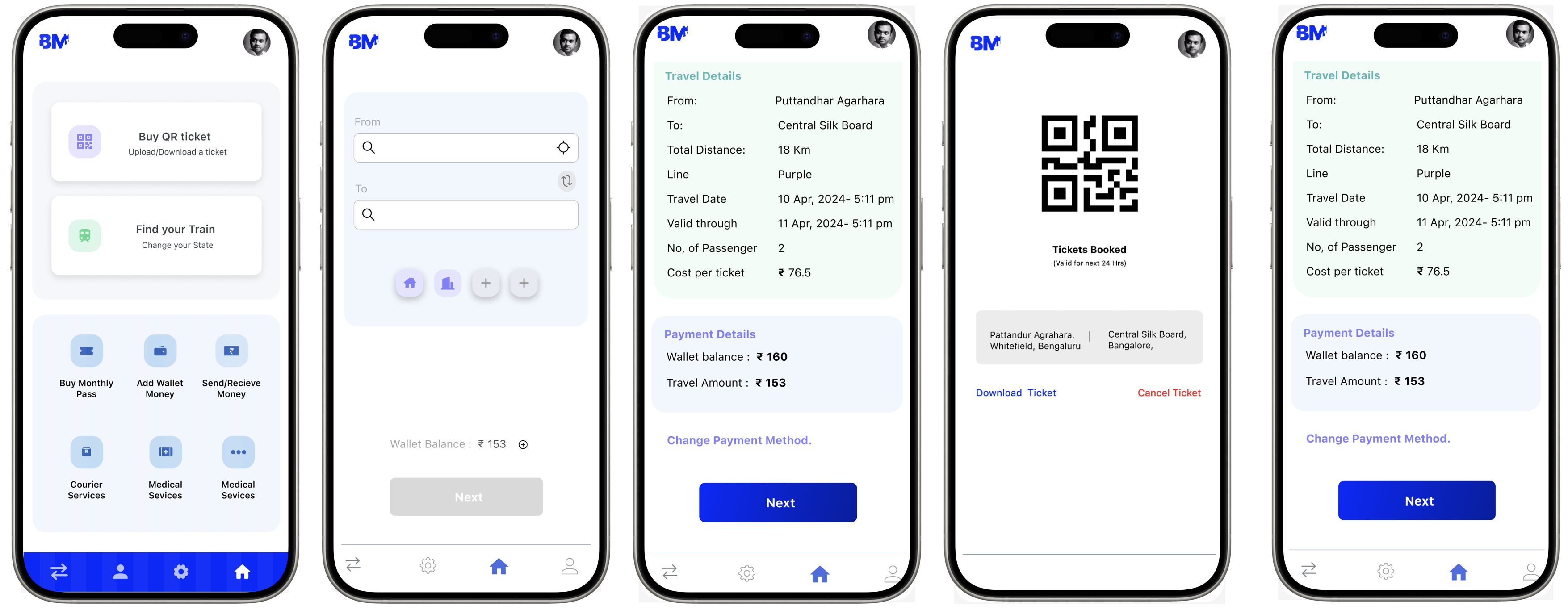
- Home Screen: A dashboard that shows key functionalities like “Plan a Journey,” “Buy Tickets,” “Metro Map,” “Favorites,” and “Recent Trips.”
- Navigation: A bottom navigation bar for easy access to essential features, like Home, Search, Tickets, and Settings.
- Key Features:
- Search and Plan Journey: A search bar at the top for quick route planning. Users can input starting and ending stations, and the app should suggest the fastest or most convenient routes.
- Real-Time Updates: A section that provides live updates on metro timings, delays, and alerts.
- Ticketing System: A streamlined ticketing process that allows users to purchase, store, and validate tickets directly through the app.
- Multi-City Integration: Easy switching between different city metro networks with a dropdown or tab system.
- Accessibility:Ensure the app is accessible to a wide audience, including those with visual or motor impairments. Use high contrast ratios, legible font sizes, and voice commands or screen reader support.
- Prototyping and Testing:Create interactive prototypes to test the user experience and gather feedback. Make iterative improvements based on user testing, focusing on ease of use and reducing any friction points in the user journey.
3. Final Touches
- Microcopy: Clear and concise language throughout the app. For instance, use straightforward labels like “Buy Ticket” instead of “Purchase Transit Pass.”
- Feedback Mechanism: Implement an easy way for users to provide feedback or report issues directly through the app.
4. Presentation:
- Mockups and Prototypes: Prepare mockups for the key screens and interactions, such as the home screen, journey planner, and ticket purchase flow.
- Design System: Create a design system that documents the visual language, including colors, fonts, icons, and components, ensuring consistency across the app and any related platforms.
This approach will ensure that the “One India Project” app is not only visually appealing but also user-friendly, making metro travel across India a seamless experience.
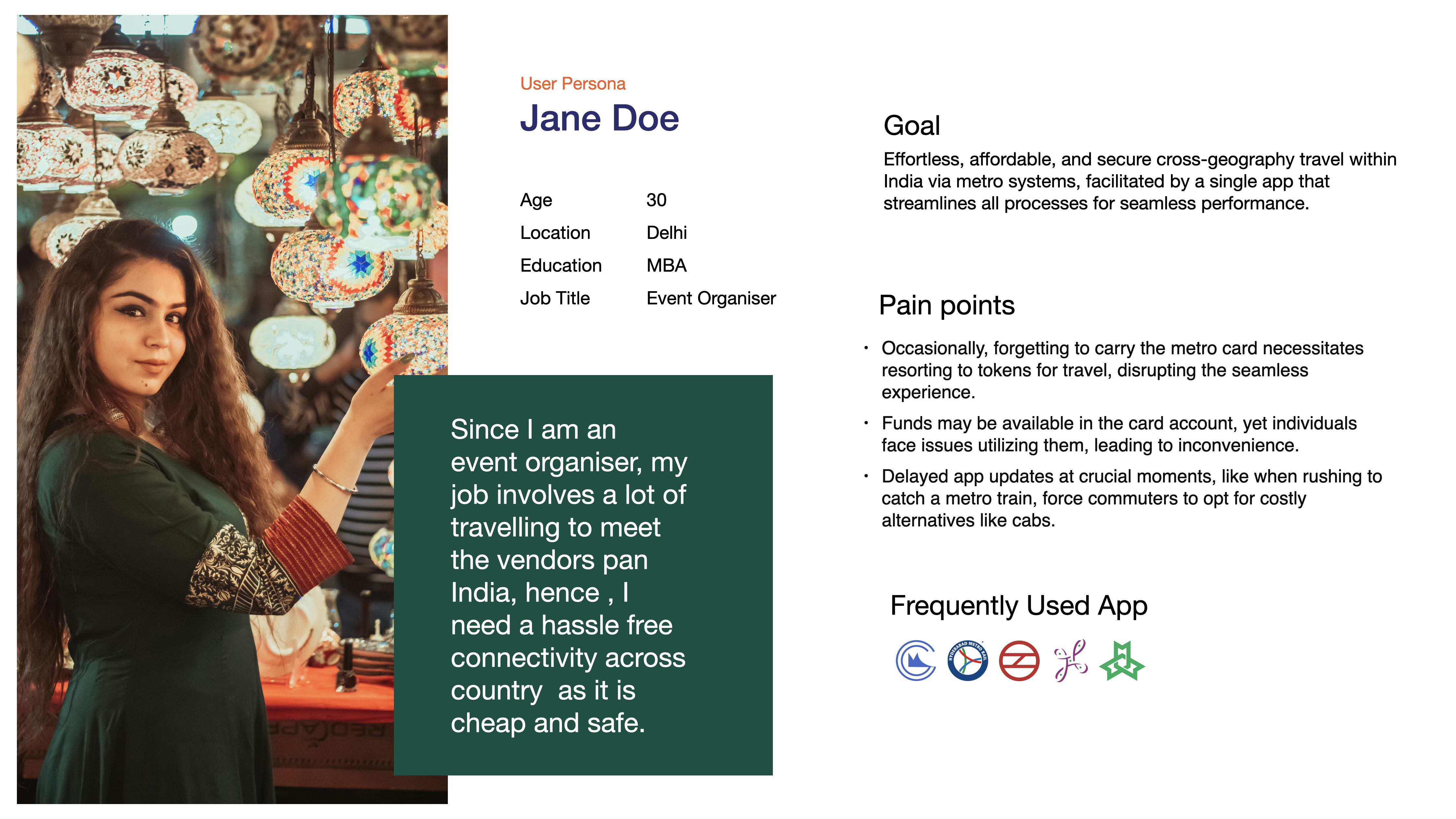
USER PERSONA
USER JOURNEY
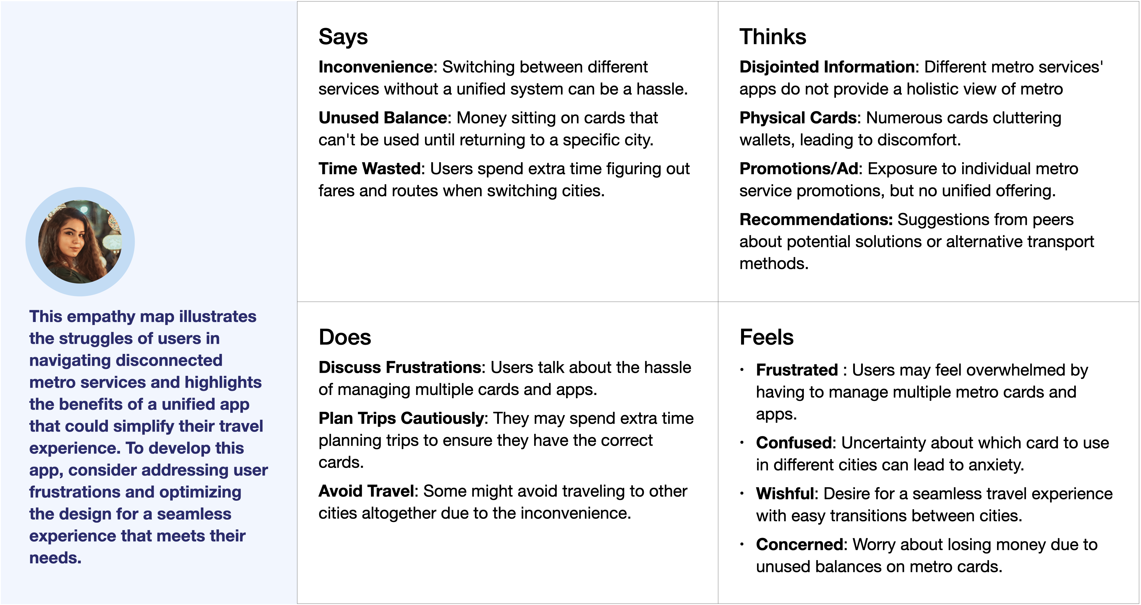
Empathy Map
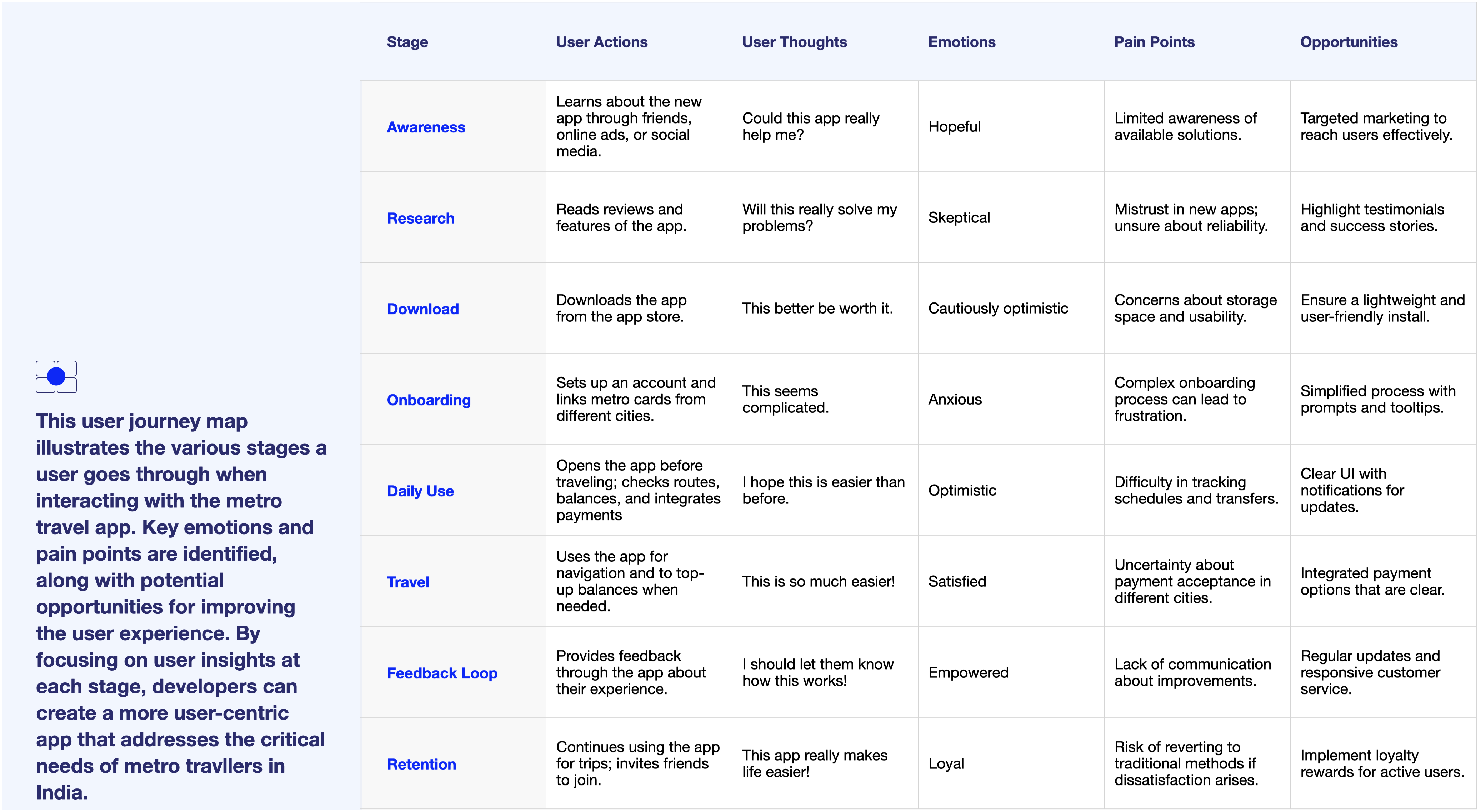
User journey Map
LOW FIDELITY PROTOTYPE
and initial Prototype
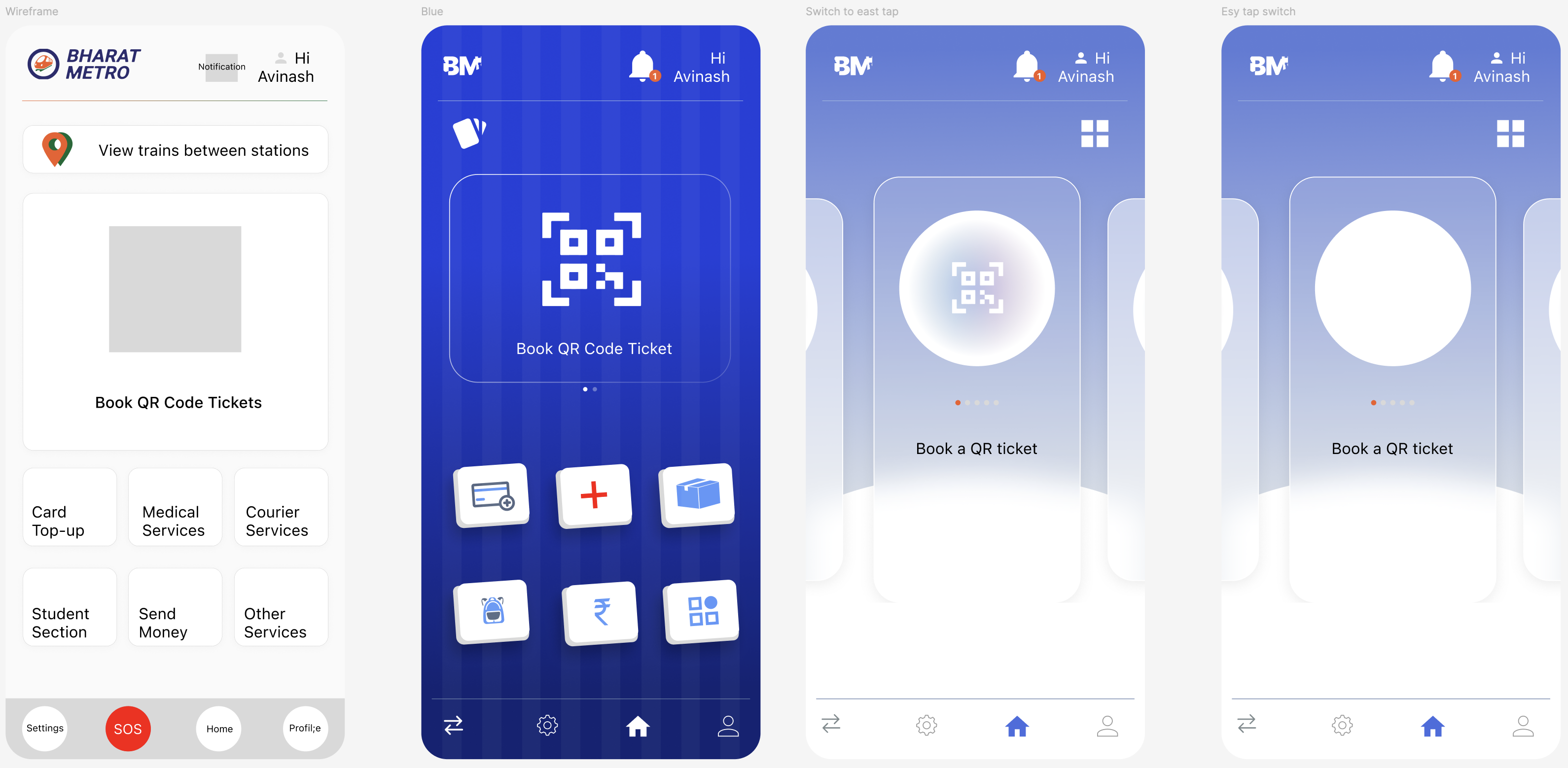
HI FIDELITY PROTOTPE