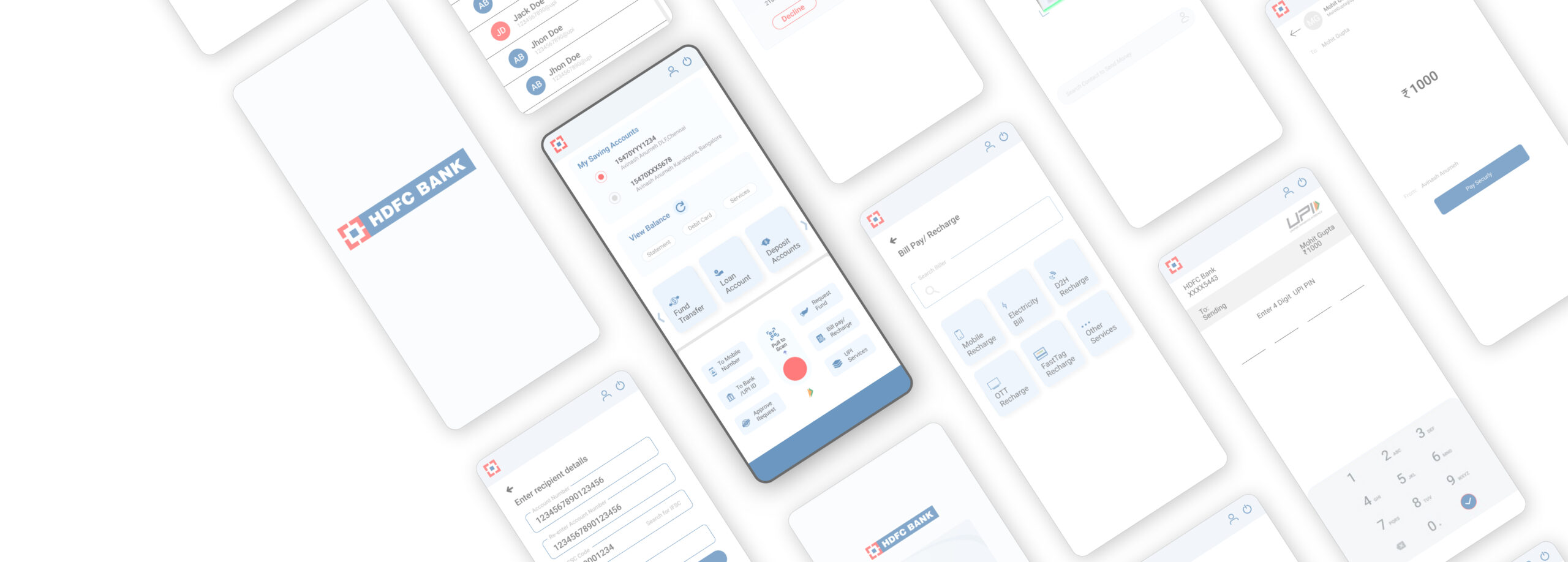
Enhancing UI/UX
HDFC Bank Mobile Application
The Problem Statement
I require a better UI for the HDFC banking app so that its present app becomes easy to understand and navigate.

The Goal Statement
Redesign the app to achieve a more understandable, usable, design, easy to pay with fewer taps, and bill pay solution.
The Process
Empathise, define, ideate, design, test
Empathise
User research,
Empathy Mapping,
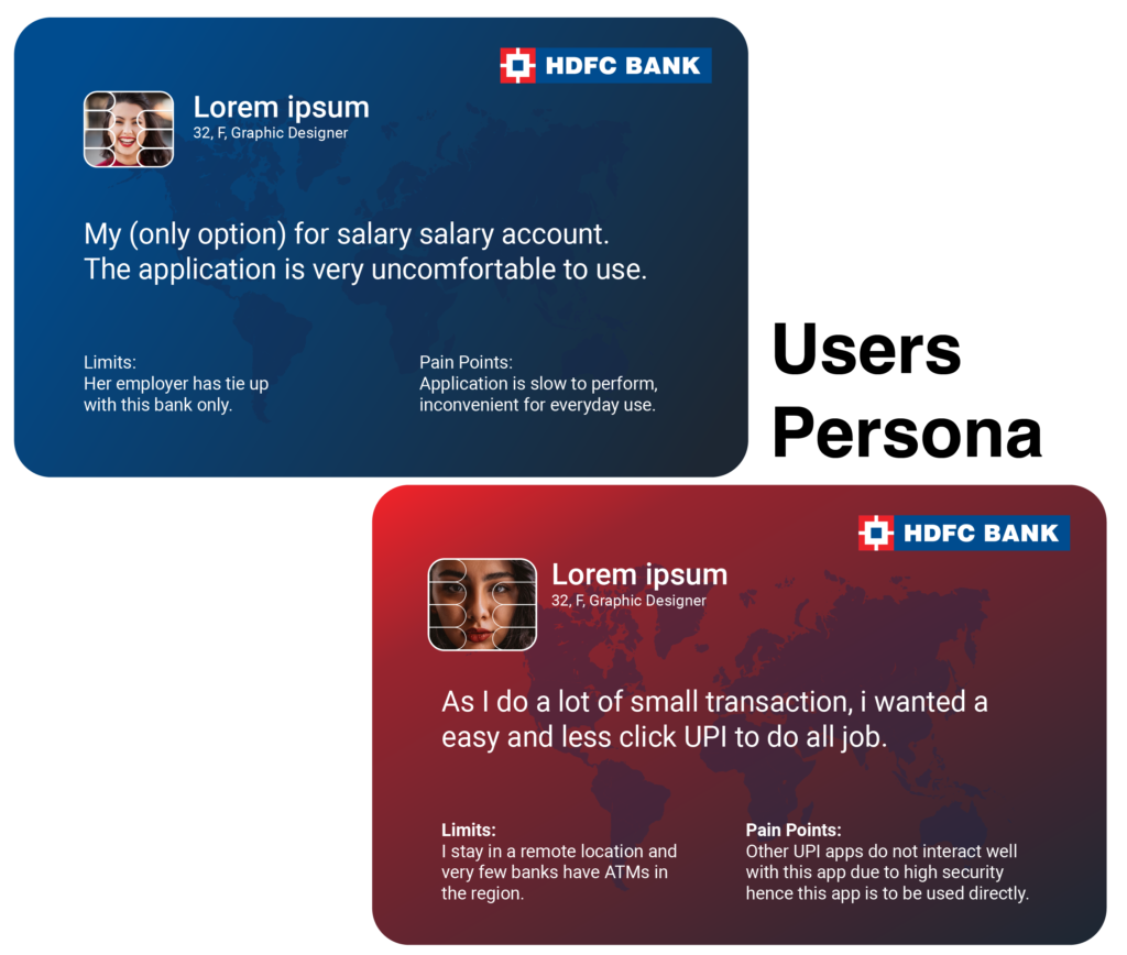
User persona,
User journey map,
Competitive analysis
Define
Value Proposition,
Competitive analysis,
Goal Statement,
Problem statement,
Hypothesis statement.
Ideate
BrainStorming
Userflow
Information Architecture
Design
Sketch
Wireframe
Prototype
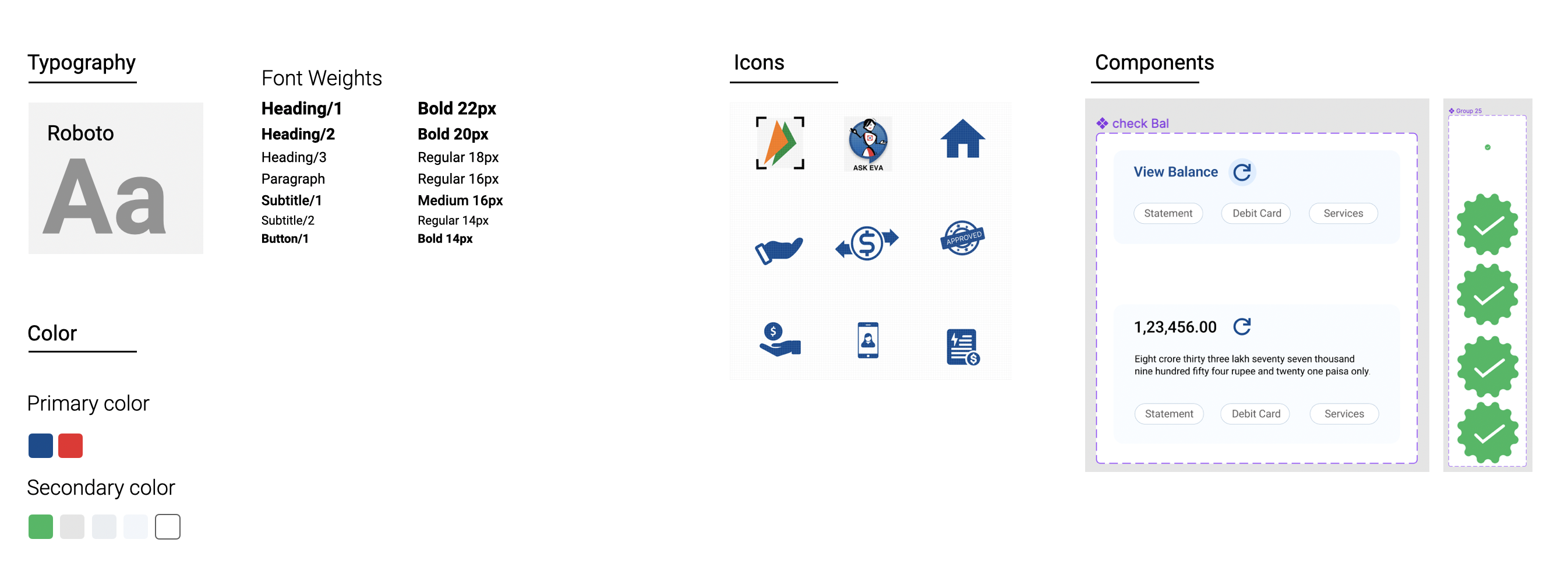
Style guide
Visual Design
Test
Usability Test
Affinity Mapping
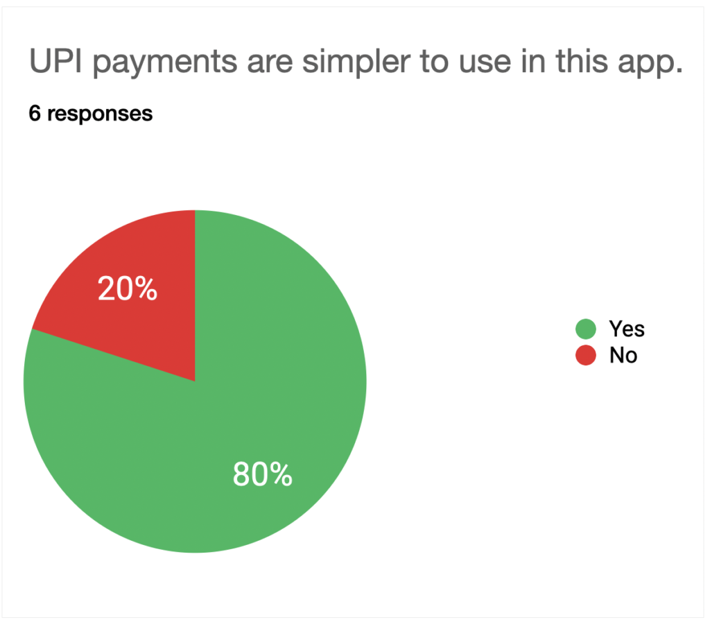
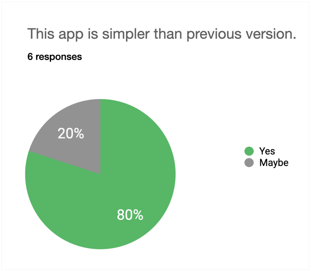
Survey Insight
User Research
- Need to find out what I am looking for in first glance.
- Its difficult to navigate through the small cues.
- The text is in very fine style which makes less readable.
- The text colour is light .
- Things are distributed all over the screen
- The splash/ loading screen has a squeezed image.
- The UPI is very difficult to use and hence does not make it convenient to use in everyday application.
- The application is slow,
- Log out session is very long and
Interview Questions
Open ended question
- What is ur personal experience while using the app and what difficulty did you face.
- What is the Problem you face when u navigate through the app.
- Are you comfortable with the text(quantity/Placement) on screen ? Is the text clear enough to read ?
- Do u find issues while searching for a particular service on screen ?
- Are the transaction services easy to use ?
Close ended question
- What is your frequency of using this application ?
- How much would you like to rate the screen loading time?
- How much would you like to rate the transactional time?
- Have you felt any difficulty during logging in and logging out ?
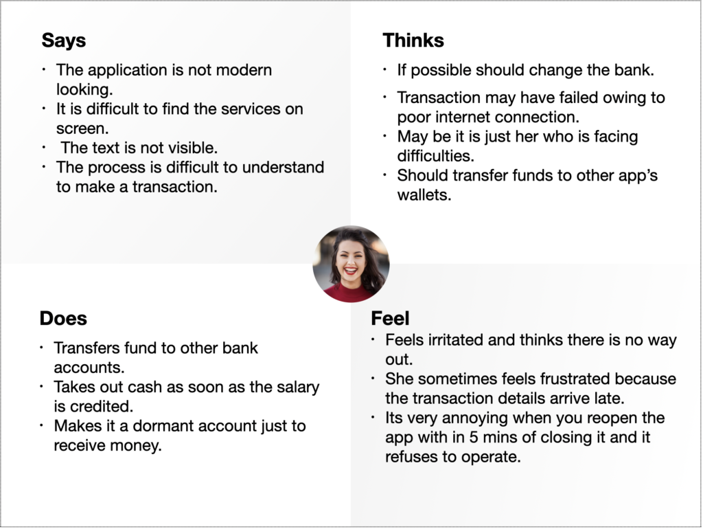
Empathy Map
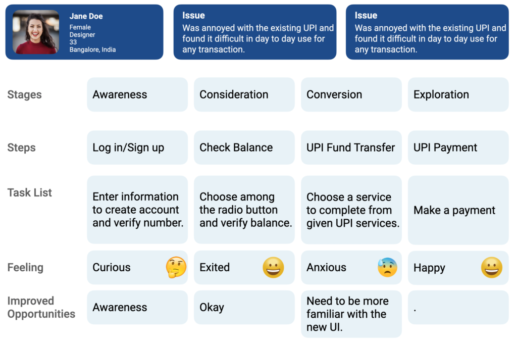
User Journey map
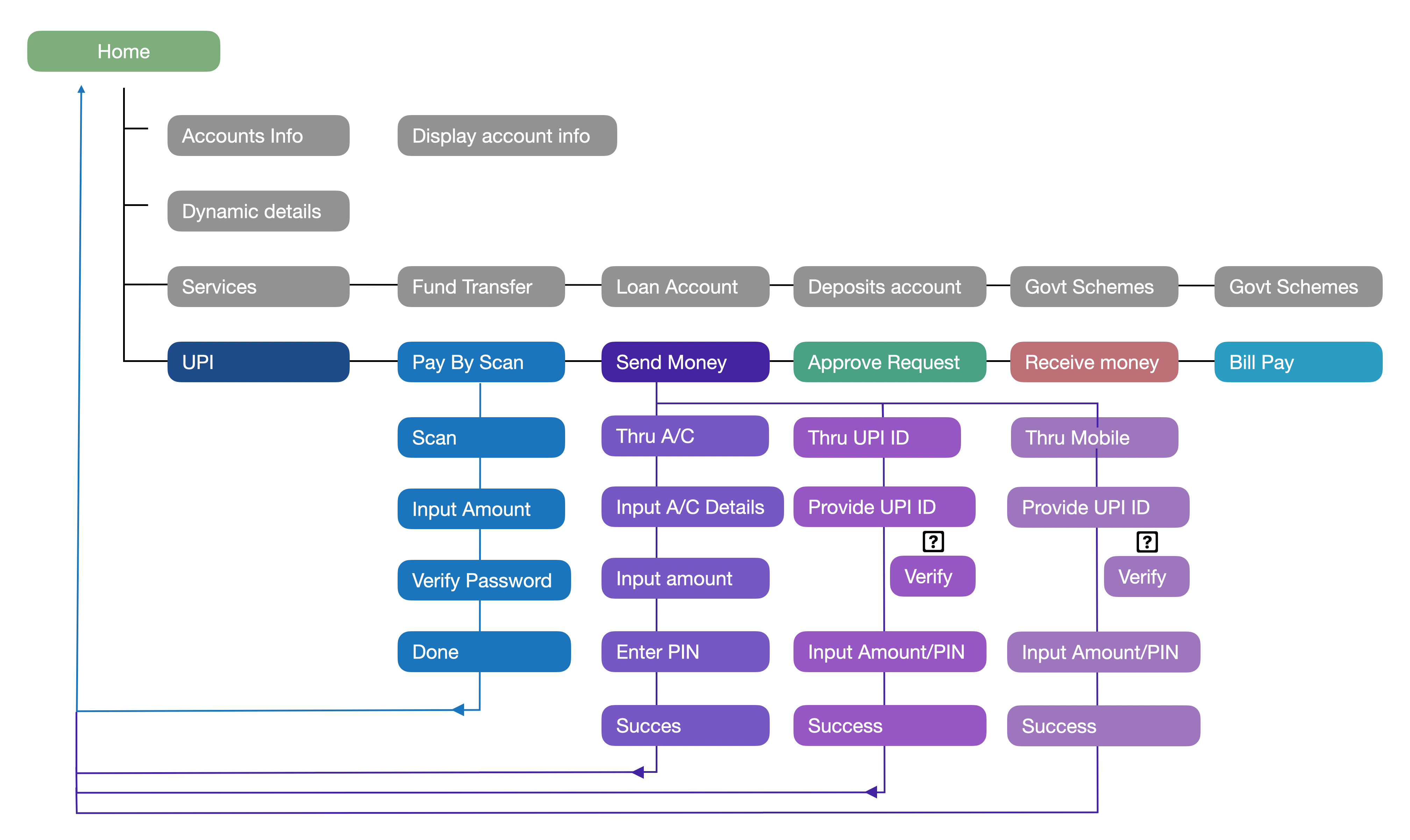
User Flow


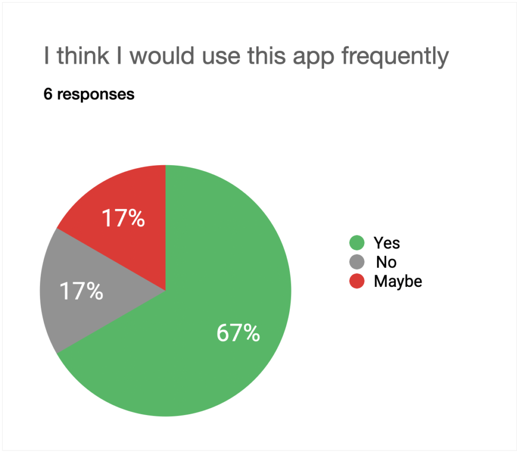
User Survey
Style Guide
